W Floral Studio
Floral Boutique
Intro
Skills
Duration
User research
User testing
Interface design
Prototyping
Two weeks
W Floral is a floral boutique located in Richmond Hill, Ontario. They sell flower arrangements, plants, and provide services for weddings, and special events. Their primary methods of conducting business is through their brick and mortar store, and over the phone orders. Their online sales account for just 20% of their total orders in a given month.
Our team of 4 at General Assembly Toronto was tasked with identifying the existing weak points in the online experience to increase conversion rates and simplify the user journey. During the span of two weeks we conducted competitive analysis, user interviews, card sorting exercises, and usability tests.
Goal
Translate the success of the in-store experience to the online store, with the objective of improving conversion rates.
Clearly communicate product offerings and improve catalogue searchability.
Approach
Build a shopping experience that mirrors the simplicity of the brick and mortar store.
Researching, interviewing, designing, and testing user flows and interactions.
Iterating designs based on user feedback.
The challenge
With an extensive offering of flower arrangements and multiple service offerings it was important to organize the information in a way that would be easy to interpret for any customer visiting the website. We broke this challenge down into three sections.
1. Information architecture and how our users find products
Screens for existing menu, filters, and product listings page on W Floral
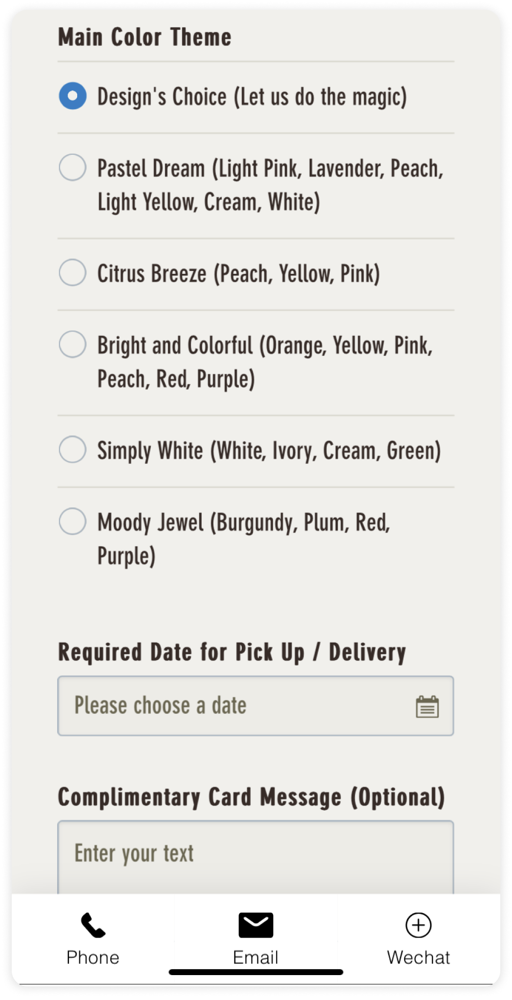
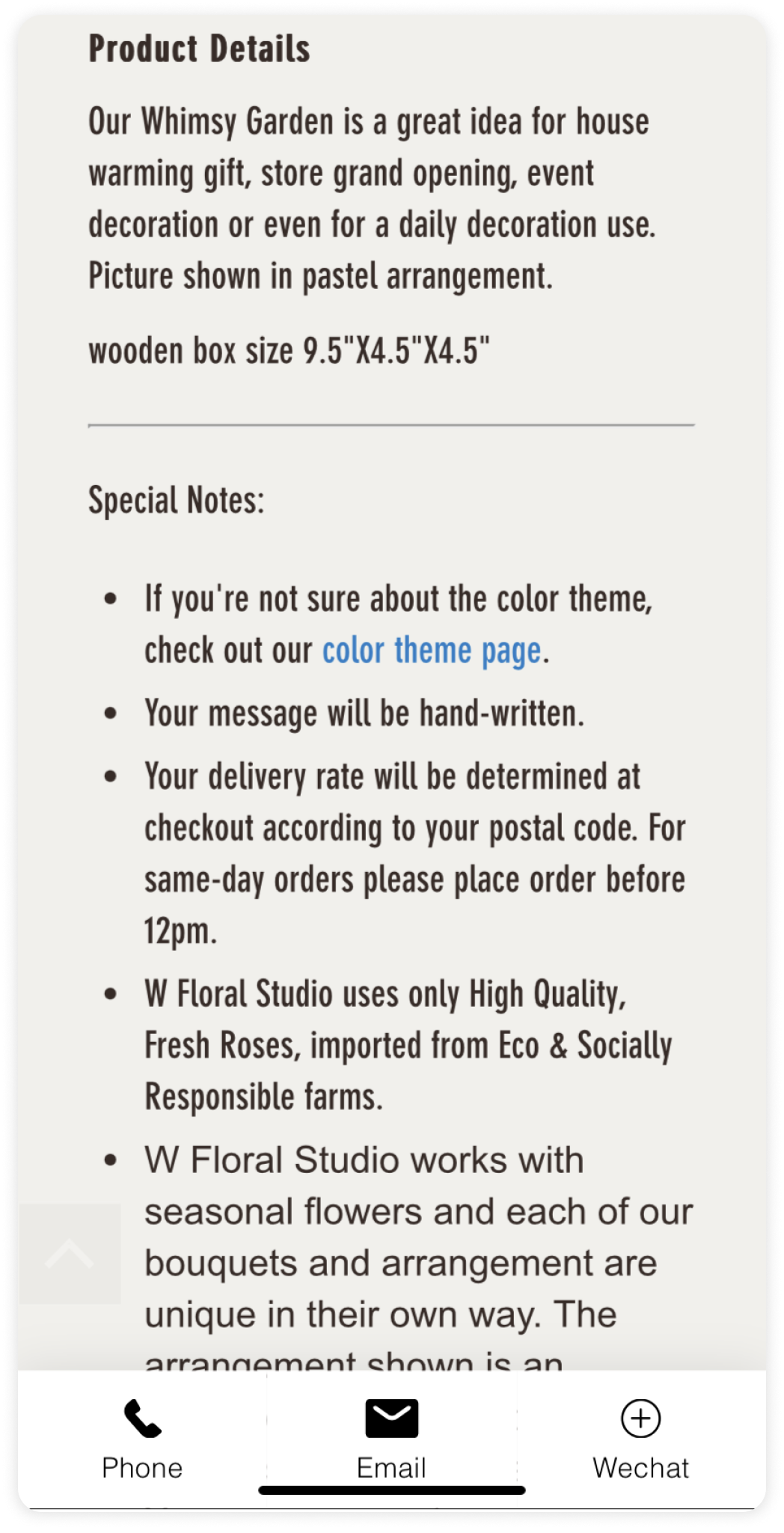
2. Product page and details
Screens for the existing product page in vertical scroll order
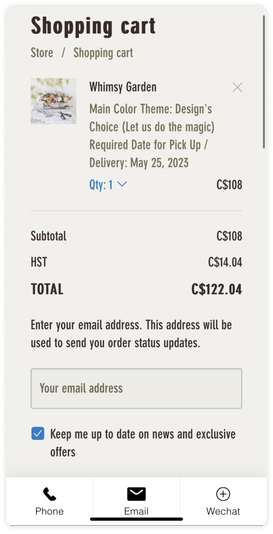
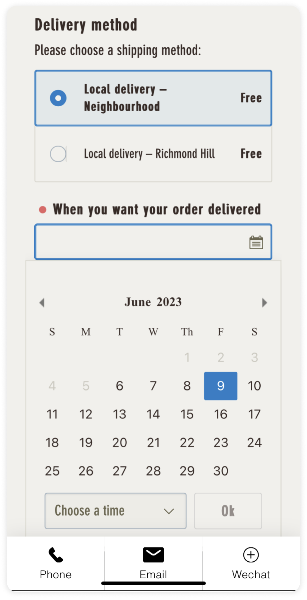
3. Shopping cart and checkout process
Screens for the existing cart and checkout process
Competitive research
To kick off our discovery we focused on the top competitors in the Greater Toronto Area - specifically ecommerce only businesses in the floral industry. This distinction was important if we were to challenge the market for online customers.
Tonic Blooms
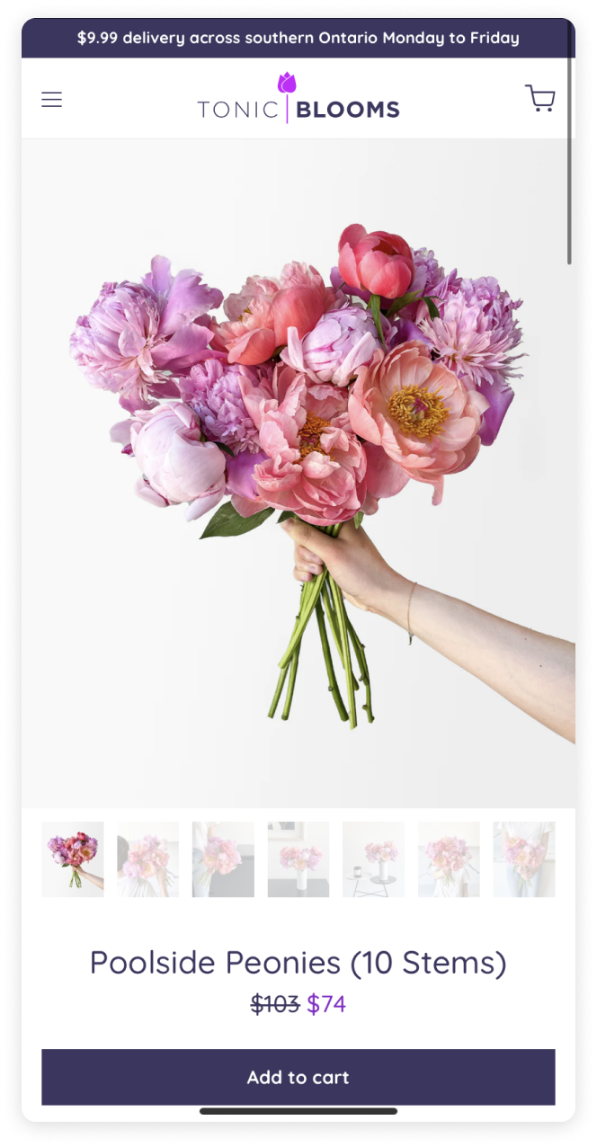
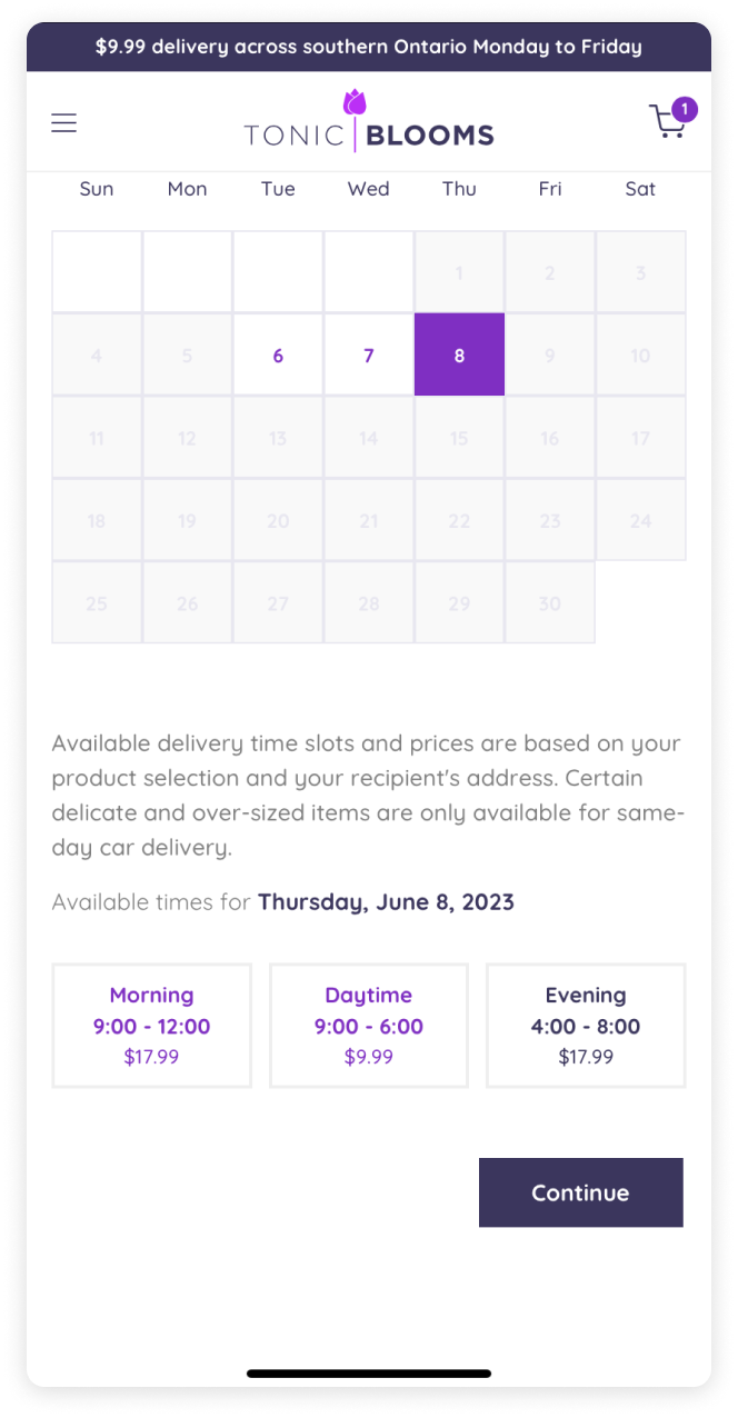
Our competitive research kicked off by evaluating the product pages and checkout process of Tonic Blooms. This helped us gain important insights into our users' expectations and needs while shopping for flowers.
Product page, cart, and delivery selection
Toronto Blooms
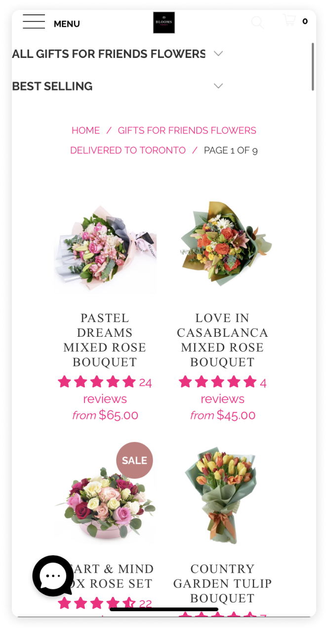
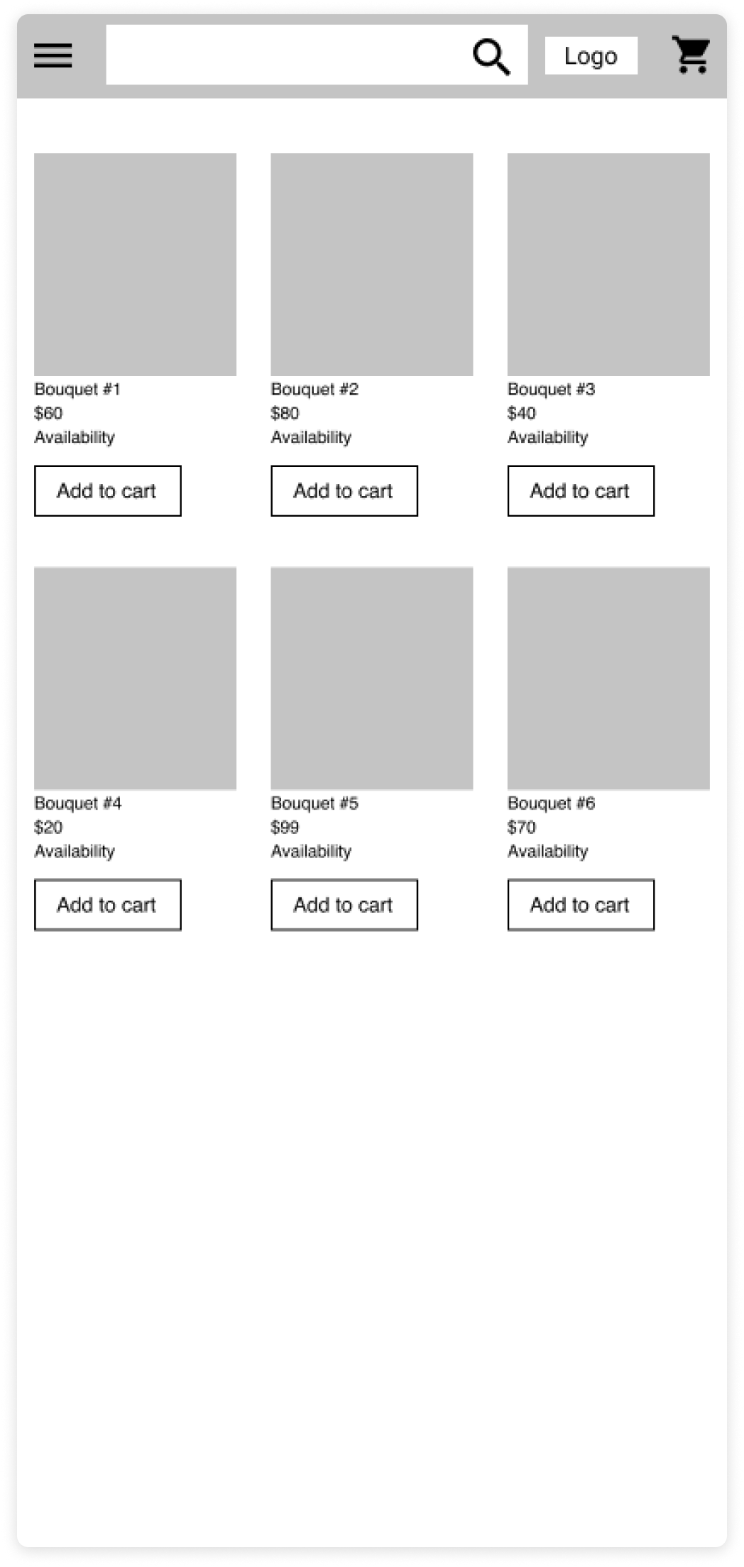
To grasp the complexity of a large product offering such as W Floral’s we gave several users the task of purchasing a gift for a specific occasion. We mapped and annotated screen flows focusing mainly on searchability, giving us further insight into some of the pain points.
Menu and product listings
User needs
Next we established personas of two users using empathy mapping to better understand what our users feel, think, and want out of their shopping experience. The insights came from user interviews and task analysis which informed the basis of our user journey.
The last minute shopper
Make orders that need to be fulfilled within 24 hours
Prioritize products with same day shipping over pickup
Typically find products through high level categories such as “occasions”
The planner
Plans for special occasions ahead of time - same or next day delivery not a factor
Take the time to browse products, use multiple filters, and read product descriptions
More likely to call for additional product/service details, or visit the brick and mortar store
Last minute shopper, Emily
Emily is a busy marketing executive who frequently forgets special occasions until the last minute. She relies on online platforms for convenience and needs a fast, reliable solution to find and purchase flowers quickly. Emily wants assurance of on-time delivery and a wide selection of flowers. However, she faces challenges in decision-making, trust, and delivery reliability. She primarily uses her smartphone for browsing and comparison shopping. Emily prefers user-friendly websites with quick ordering processes, same-day delivery options, and occasion-specific recommendations.
Planner, Jason
Jason, an art director, is an informed flower enthusiast who values quality, and uniqueness. He spends time researching different online flower shops and appreciates a wide selection of high-quality flowers and arrangements. Jason seeks a seamless browsing and purchasing experience and values customization options to personalize his choices. His main concerns are the overwhelming number of options, ensuring quality and freshness, and reliable delivery. John relies on detailed product information, high-quality imagery, and knowledgeable customer support to guide his decision-making process.
The iterative process
How might we simplify the decision-making process and offer in-depth details ensuring that users can quickly find the perfect arrangement?
The next step was to go through the design iteration process. The user personas established the foundation for what users on W Floral needed, and what they found frustrating.
We knew that a solution needed to benefit both user types in order for it to be considered a success by the business. This meant addressing the frustrations around finding products, information, and speed of the ordering process. These common links allowed us to establish a hierarchy of needs and prioritize the important features during the design process.
Add to cart
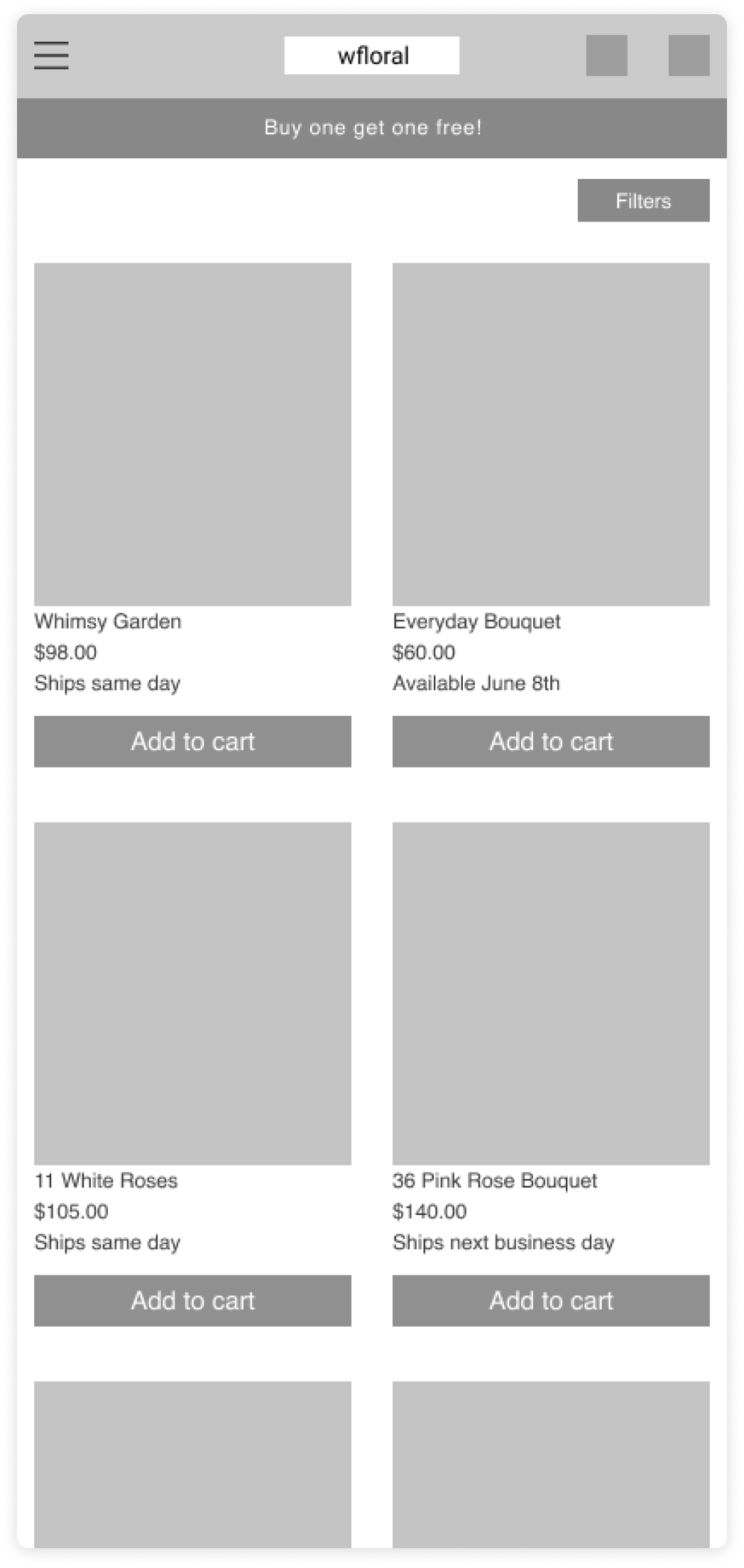
For our users it was essential to make the experience seamless, and as fast as possible for their needs. To improve the speed of the ordering process, we added the “Add to cart” button to products when browsing.
In our testing we found that it was not only beneficial in improving the time it took to order, but it also served as a method for our planner users to quickly add things to their cart and later compare without having to navigate between different pages - a result we did not initially anticipate.
First low-fidelity test
Second iteration
Final composition
Navigation and product searchability
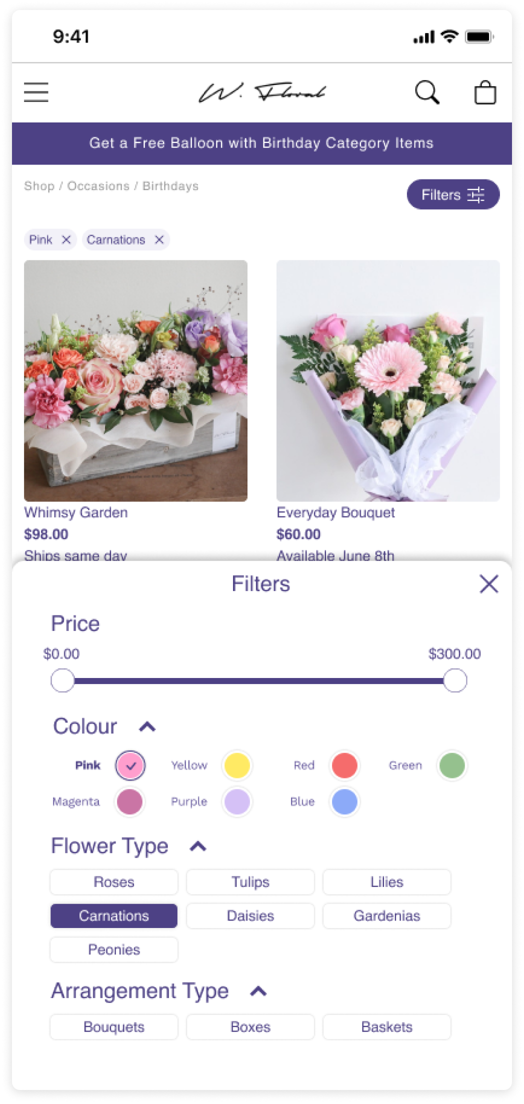
In order to meet the expectations of our users we needed to show them the products they were looking for in a familiar format that would assist them in making decisions. To accomplish this we refined the navigation menu with product categories that were easy to understand and relevant for the occasion in question.
We did this by testing multiple menu and filter options with our users, observing their actions, taking their feedback, and iterating. Given the large product offering we grouped products into broader categories and gave more control to our users through improved filtering and search options.
Original menu architecture
Updated menu architecture
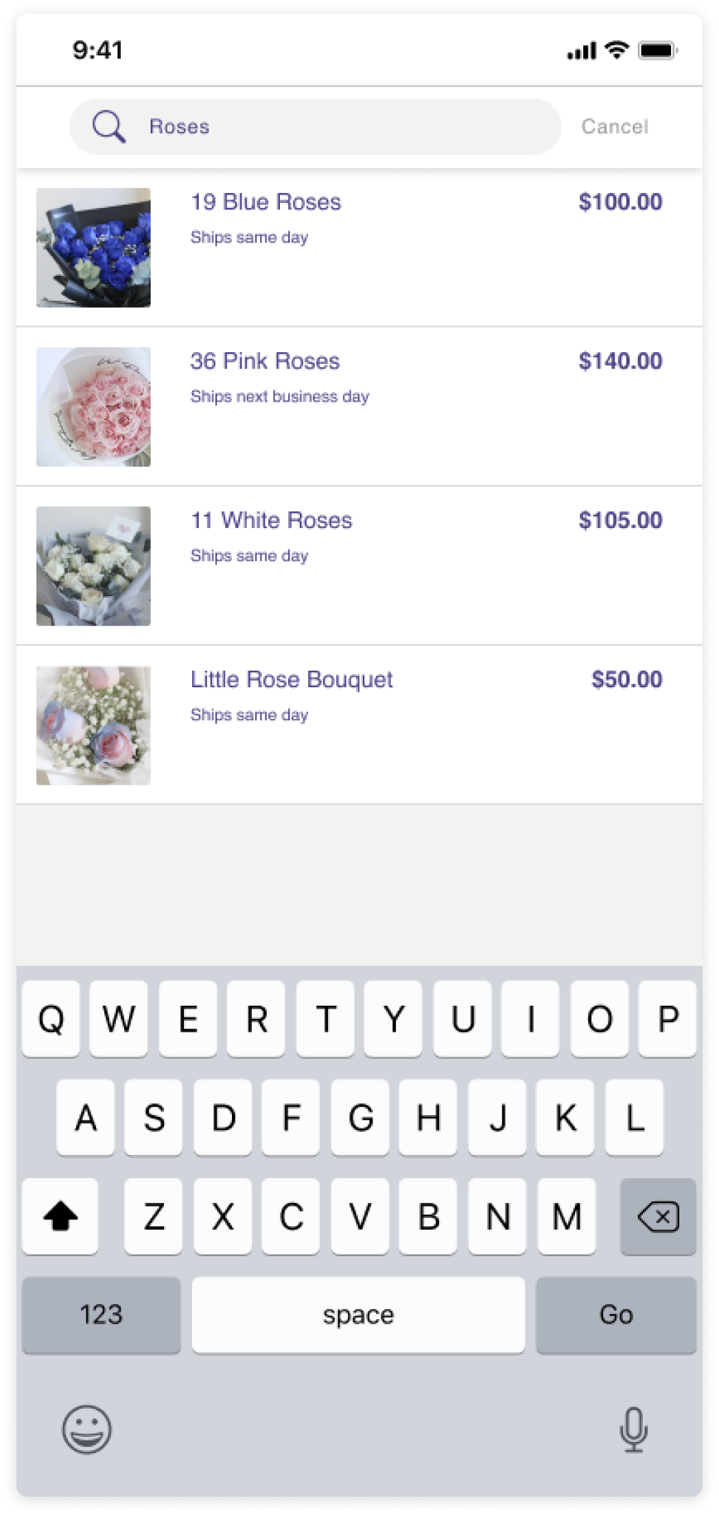
Updated search functionality
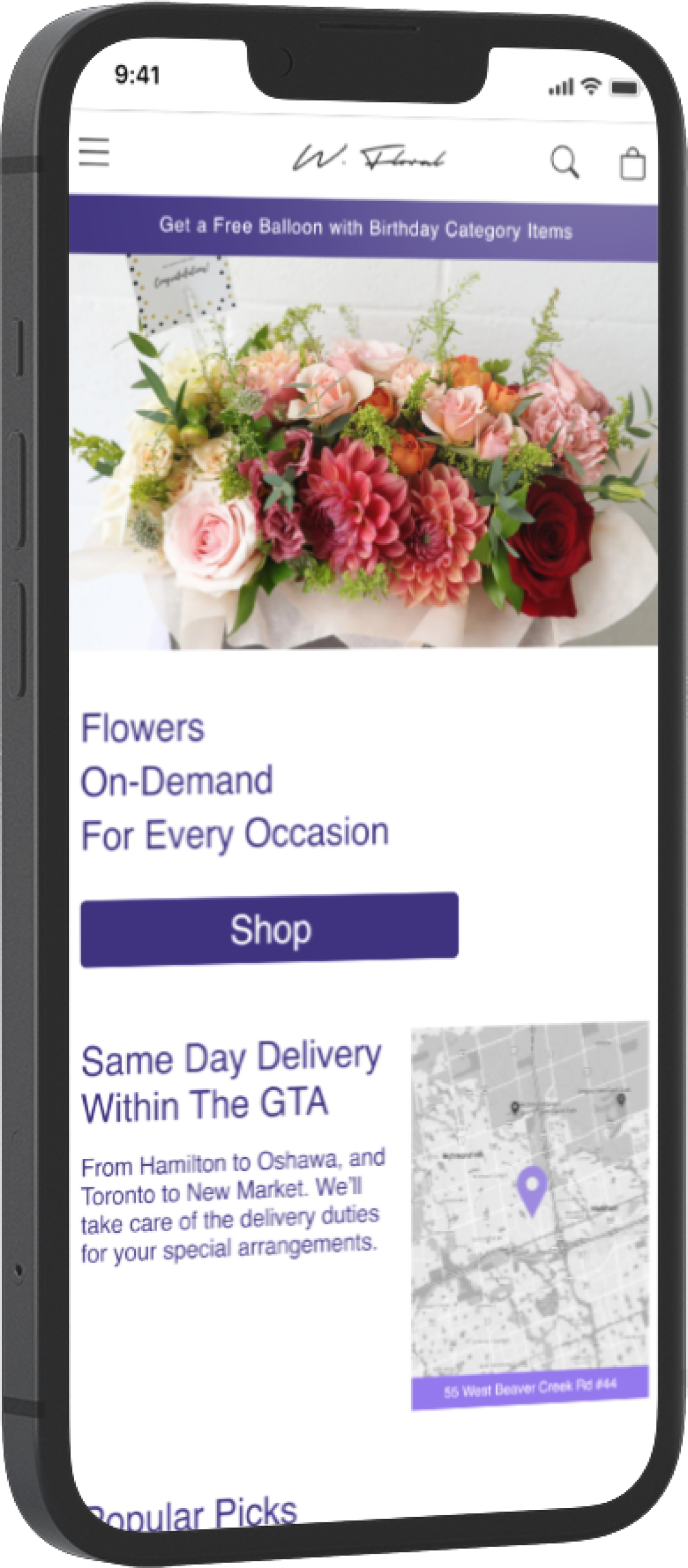
Updated menu layout
Updated filter options
Product page
A common pain point that came up amongst all our users during the discovery phase was the communication of product information on the product page. With these insights we broke it down into 3 categories for improvement:
Product selection
What’s included
Delivery/pick up details
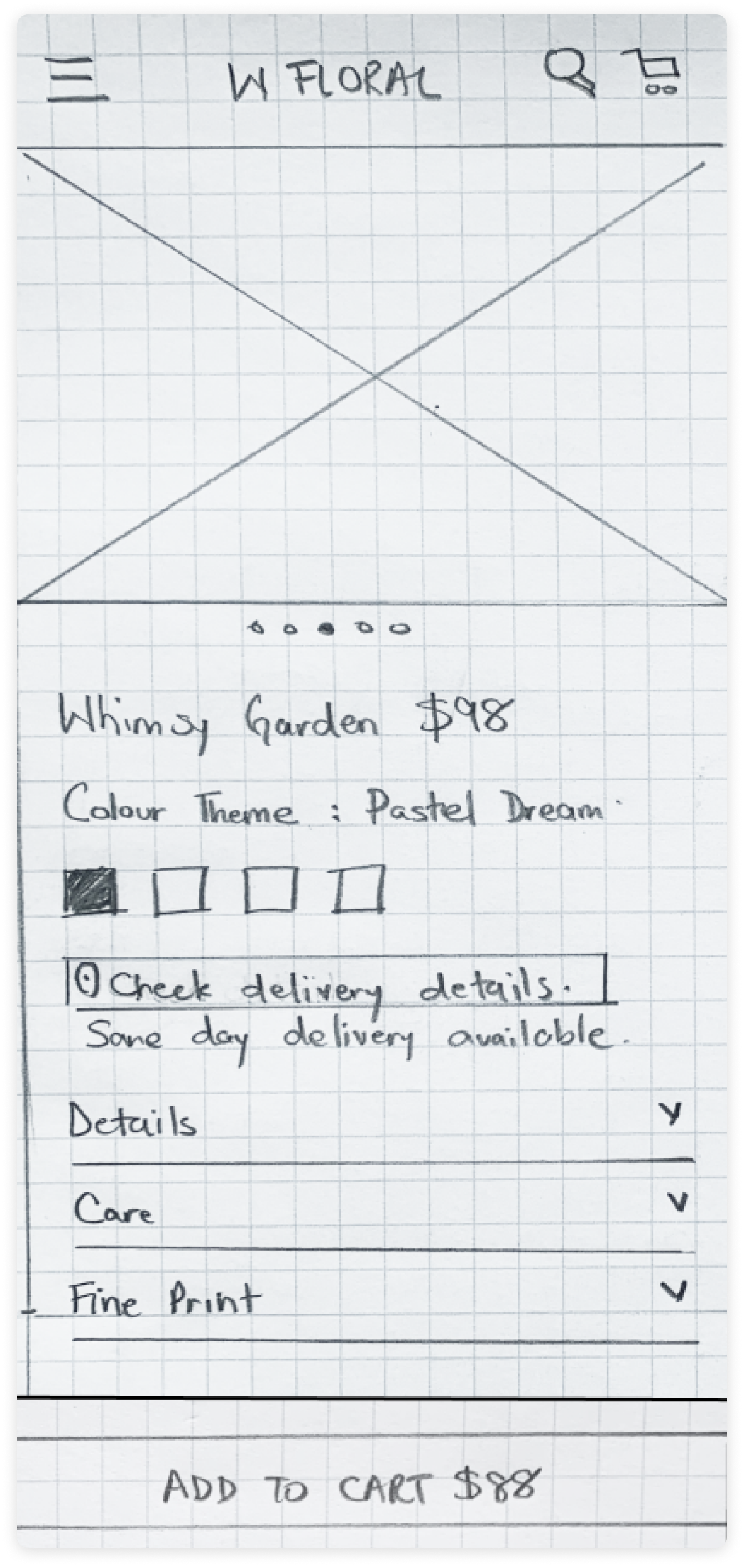
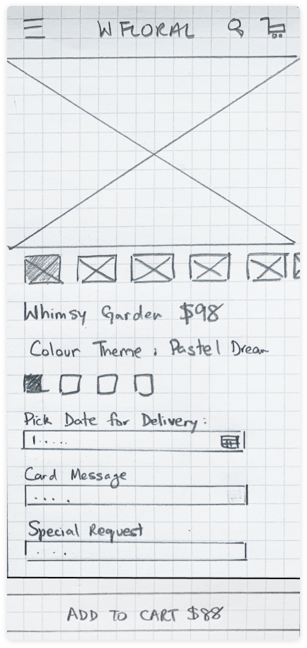
We updated the image gallery to be dynamic based on color theme selection - this improved our users' understanding of what they would be receiving from a visual standpoint, but also gave us flexibility in the screen real estate as we could now dynamically update the “What’s included” to be relevant to the color theme selection.
Version 1
Version 2
Final composition
Checkout
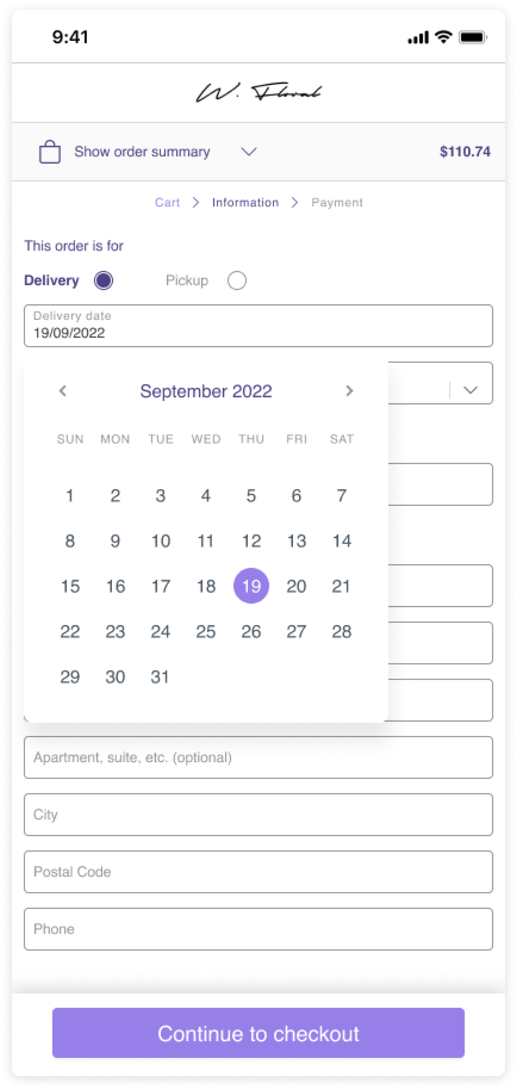
It was important for our users to feel that they could trust W Floral to communicate order details, and handle their personal information. To alleviate these concerns we designed the checkout process to be more consistent with other ecommerce experiences while clearly displaying the details of their delivery/pick up selection.
Cart details
Delivery date selection
Order confirmation
In conclusion
Our designs focused on decluttering and prioritizing the most important information to improve the efficiency of the ordering process for our users.
The next steps would be to implement these design improvements to the live environment and closely monitor user feedback and analytics. By continuously iterating and refining the online shopping experience we can increase sales and deliver an exceptional user experience for both last-minute shoppers and meticulous planners.


