Toronto Bike Share
PBSC
Intro
Duration
Skills
User Research
User Testing
Interface Design
Two weeks
Toronto Bike Share (PBSC) is a bike share service in Toronto that rents out bikes to it’s customers via hundreds of bike stations located throughout the city. In order to rent out the bikes PBSC uses a phone application that keeps track of time, accepts payment, and allows it’s users to locate stations by search or map.
Our team of 4 at General Assembly Toronto was tasked with researching the existing pain points in the application that could be addressed and improved upon. During the span of two weeks we brainstormed, interviewed, designed, prototyped, and tested solutions that tackled the issues our users were encountering when using the Bike Share application.
Goal
Clearly communicate our pricing structure to alleviate user confusion and frustration.
Reduce anxiety around trip planning and overage charges.
Approach
Build a cohesive user experience that addressed our users pain points.
Interviewing, researching, designing, and testing user flows
Iterating designs based on user feedback for potential future implementation
The challenge
The existing version of the Bike Share app focuses on converting users into customers with little consideration for the user journey. During our initial research we broke this down into three primary insights:
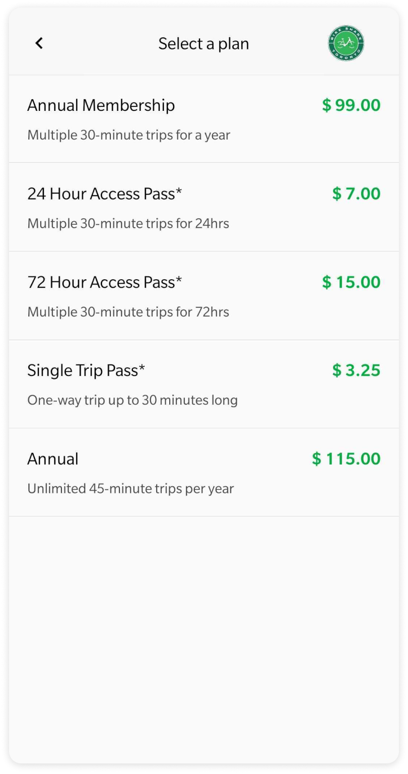
1. Long sign up and payment process
In order to rent a bike, new users are required to first select a plan and then sign up for a mandatory account - no third party integrations such as Google, and no option to continue as a one time user.
Existing payment flow (requires sign up)
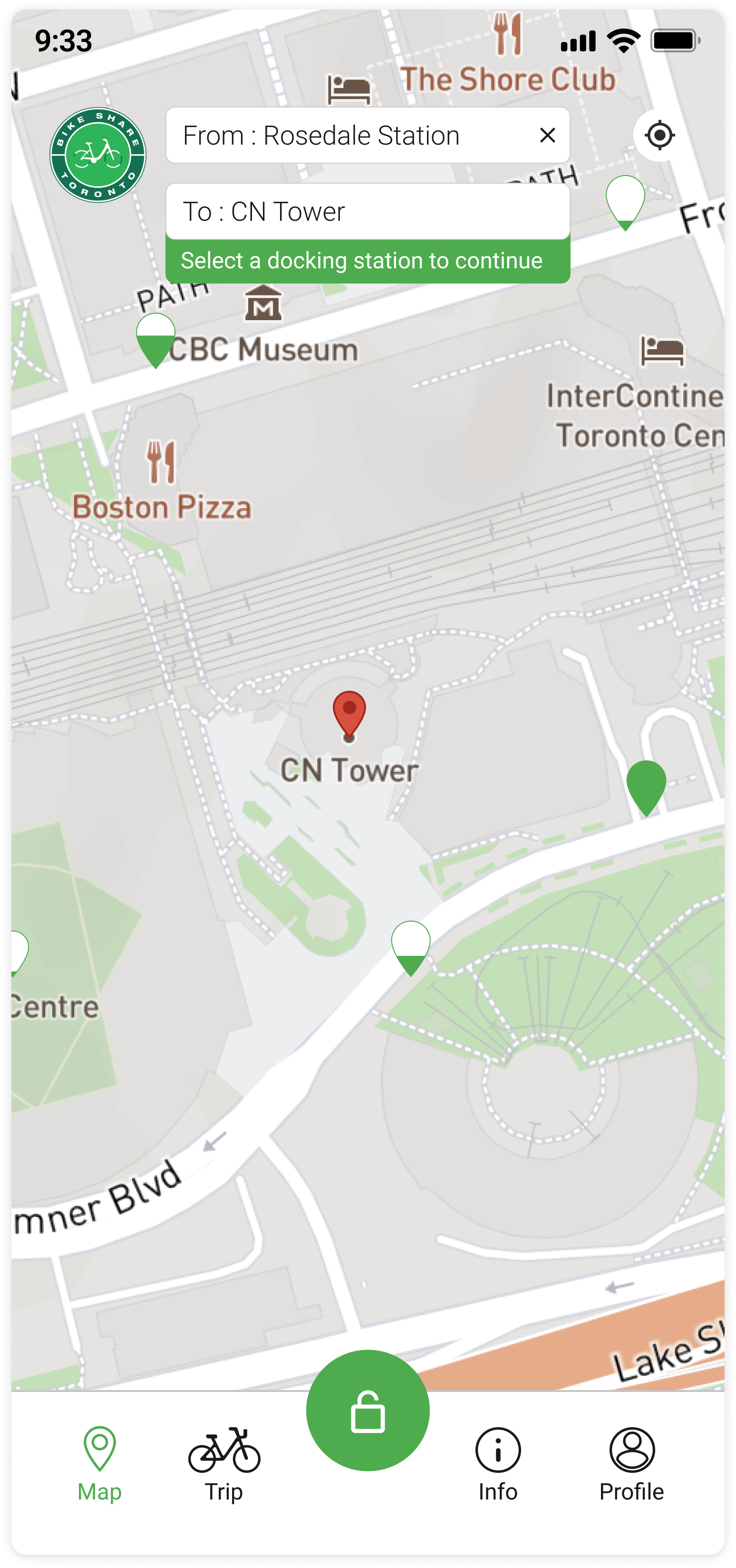
2. Difficulty planning trips around docking stations
With the amount of docking stations available throughout the city, our users found it difficult to navigate the map if they didn’t know the name of a docking station. In addition, they had no way to plan trips between docks without leaving the application to use Google Maps.
Existing docking station map
3. Anxiety over 30 min overage charges while riding
The biggest concern from our user interviews and reviews found online was the clarity surrounding the 30 minute trip timer and the overage charges associated with that.
App store rating and user review
The process
We started by interviewing existing users at multiple docking stations throughout the city, as well as new users who were using the service for the first time. We brought our results back and went through a card sorting exercise to identify common trends.
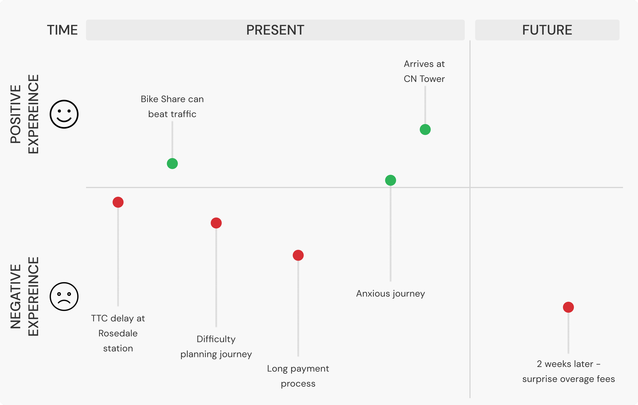
The insights gained during our interviews allowed us to map out our user journey to better identify where there were points of frustration.
Living up to expectations
Sign up and payment
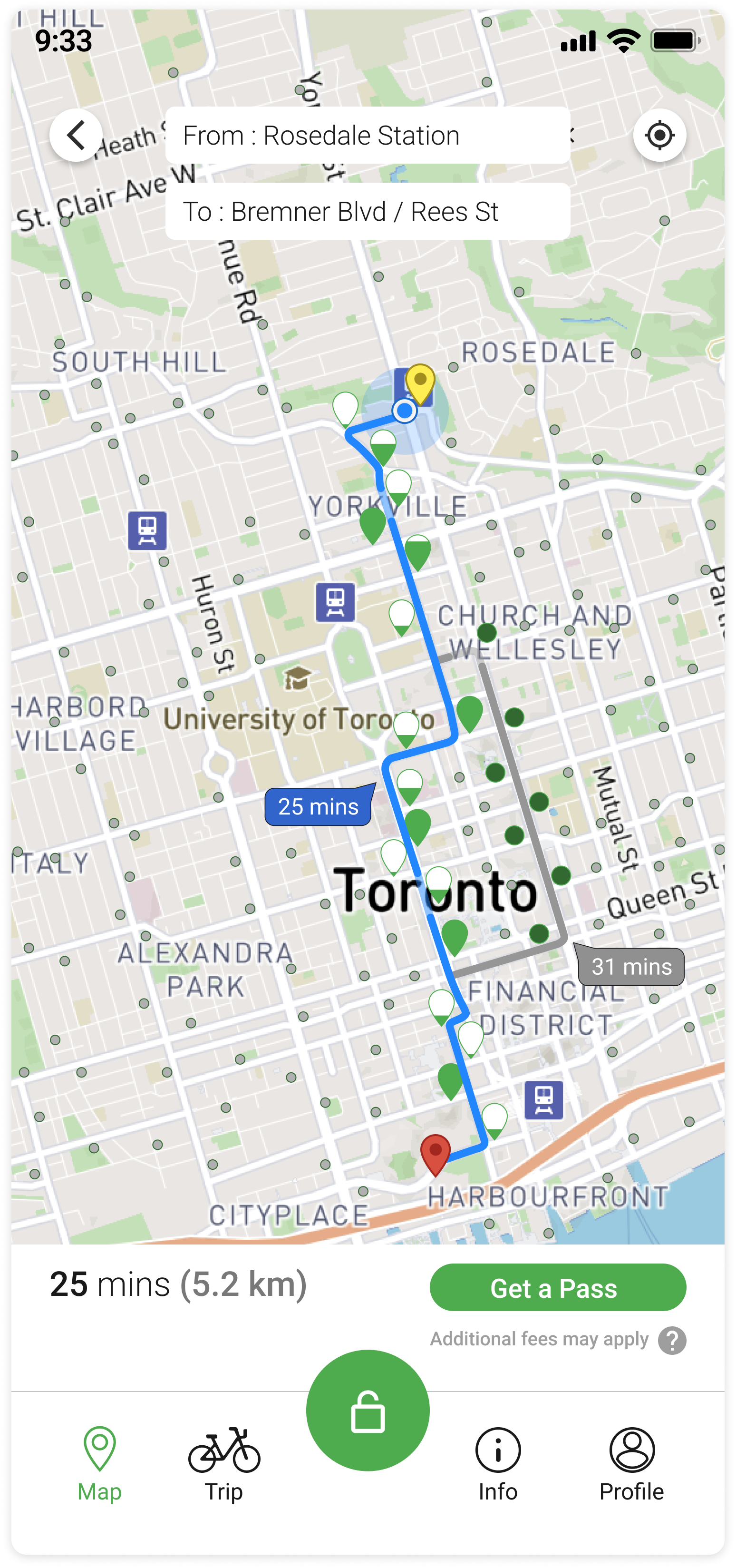
To address the issue of unclear pricing and a confusing signup/login system, we introduced an info panel to purchase and browse passes directly on the trip planner - without a login requirement. This integration also allows for recommendations based on the trip duration without the user needing to visit a new page. Everything from trip duration to estimated cost is outlined in one screen.
Trip planning
In the existing version of the application there is no form of trip planning. Instead, our users used their own workaround by looking up docking stations and then getting directions through Google Maps.
To address our users needs we improved search functionality, added navigation, and cleaned up the amount of visual information being displayed at any given time. Now when a route has been selected, docking stations that are not on your direct route are minimized but still remain visible.
Communicating overages
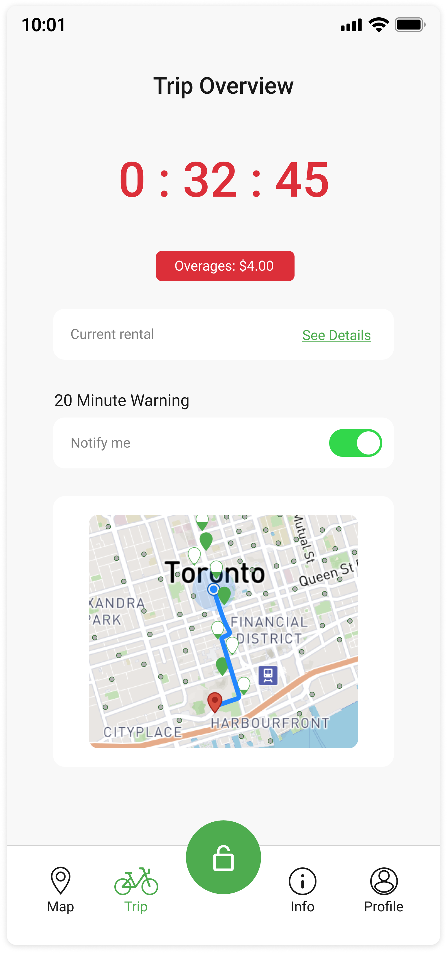
To empower our users and remove the anxiety behind overages we updated the trip page to display the most relevant information to their current journey. In addition, we added a notification system that would alert users before they receive an overage charge. This was especially beneficial for riders who used headphones or earbuds as they welcomed the addition of an audio alert to keep them informed.
As a stretch goal we aimed to introduce phone mounts to the bicycles so that Bike Share customers could safely ride and monitor the status of their current journey.
Looking ahead
Although user feedback to the changes made were positive, more time spent testing with users in the field would have given us more data to iterate and improve the solutions we implemented - this is especially true for navigation and trip notifications. Observation in a real environment would help us make crucial decisions that would not only impact ease of use, but also the safety of our users while on their trip.


